Meeting People Where They Are
Not Where We Are

Travels by train, plane, or car can be exhausting and confusing. Train station in Bolzano, Italy (photo by B Swayze).
The Tram
After a long international flight, my sister-in-law and I finally landed in Paris, excited but completely exhausted. The overnight flight we were supposed to sleep on was just a blur of awkward attempts at rest and wishful thinking.
Our brains were foggy.
This became painfully clear when we boarded the tram to leave our terminal. We rode it from one end to the other (twice!) before realizing we’d missed our stop. We couldn’t even figure out how to exit the terminal.
Finally, we spotted an airport attendant at a tram stop and we hopped off to seek direction.
The Taxi
Once we cleared customs, our next mission was simple: find a taxi.
And to our utter delight, it couldn’t have been easier, even for two sleep-deprived travelers.
Even in our tired, delirious state, we couldn’t miss the large, blue and white visual “TAXI” lettering and symbol sign and the group of official-looking attendants in matching uniforms clearly marked “official.” Even their proximity close together amidst all the travelers reinforced the clarity. (Gestalt principle of Proximity.)
One of them smiled warmly and guided us down a corridor lined with circular taxi stickers on the floor, spaced rhythmically, like footsteps on a Google Maps walking route (Gestalt principle of Continuity). The visual trail was clear and consistent.
Each attendant handed us seamlessly to the next, until we were greeted by a driver who loaded our bags, opened our doors, and confirmed our destination.
We melted into the backseat of the taix as he navigated Paris traffic weaving to and fro.
We could finally exhale. The system worked, with no pain points.
Even in our fog, the design met us with grace and empathy.
Designing for Real Moments
As User Experience (UX) designers, we live inside the systems we build. We know the flows, the shortcuts, the patterns, they’re second nature. But for the people using our designs, the experience might come at the end of a long, exhausting day or in a moment of stress and uncertainty.
In those moments, clarity isn’t a luxury, it’s a lifeline.
Good UX doesn’t assume calm, comfort, or expertise. It begins with empathy, with the willingness to meet people where they are, not where we are.
When we stepped off that tram, the airport attendant met us with grace and understanding. He gave us directions in English, and he pointed to the green “Sortie” sign that we needed to follow. He was sure that when we left we were headed in the right direction.
The Paradox of Familiarity
If we rewind our trip to its beginning we encounter another interesting concept of design.
At the airport security line, the agent repeats the same process hundreds of times:
“Take out your electronics. Empty your pockets. Water bottles empty.”
Routine, efficient, familiar.
But for the traveler, it’s confusion.
You’re juggling a passport, chugging the last of your water, trying to remember if this airport wants laptops out or in. You’re praying you don’t lose your boarding pass (yes some people like to have a paper boarding pass), or your dignity, if you’re randomly patted down.
The agent works in familiarity.
The traveler comes in uncertainty.
That’s the Paradox of Familiarity: what feels second nature to us as designers can be utterly confusing to someone new. Our expertise can make us blind.
The Curse of Knowledge
There’s a psychological trap known as the curse of knowledge: once you know something deeply, it’s nearly impossible to imagine not knowing it.
My husband calls this “expert amnesia.”
Designers and other professionals fall into this silent trap all the time. Familiarity makes us fluent and amazing at our jobs, but it can also make us blind and insensitive to our user.
We must ask ourselves: “Would this make sense to someone who doesn’t know what I know?”
Stress Narrows Focus
The Paradox of Familiarity and the Curse of Knowledge remind us to look inward, to understand why we have blind spots and how our expertise can make us insensitive to the user’s experience. But awareness alone isn’t enough. We also need to step into the user’s state of mind.
What happens when someone interacts with our design not from a place of clarity and confidence, but from fatigue, distraction, or stress?
Cognitive research shows that stress narrows focus and limits our ability to process information. Under pressure, people rely more on recognition than reasoning.
As Susan M. Weinschenk explains in her book 100 Things Every Designer Needs to Know About People, in the aptly titled chapter “People Make Errors When They Are Under Stress,”
“Tunnel action is where you keep doing the same task over and over, even though it isn’t working” (p. 193).
Under stress, people stop exploring and start repeating. (She even notes an interesting side study on how men and women respond differently to stress—worth the read.)
That’s why simplicity matters.
The taxi process offered just that—super-clear, oversized signage and helpful attendants who literally walked travelers through each step. When people are stressed, they’re not just interacting with a design; they’re navigating their own mental fog.
Good UX meets them with calm, not complexity.
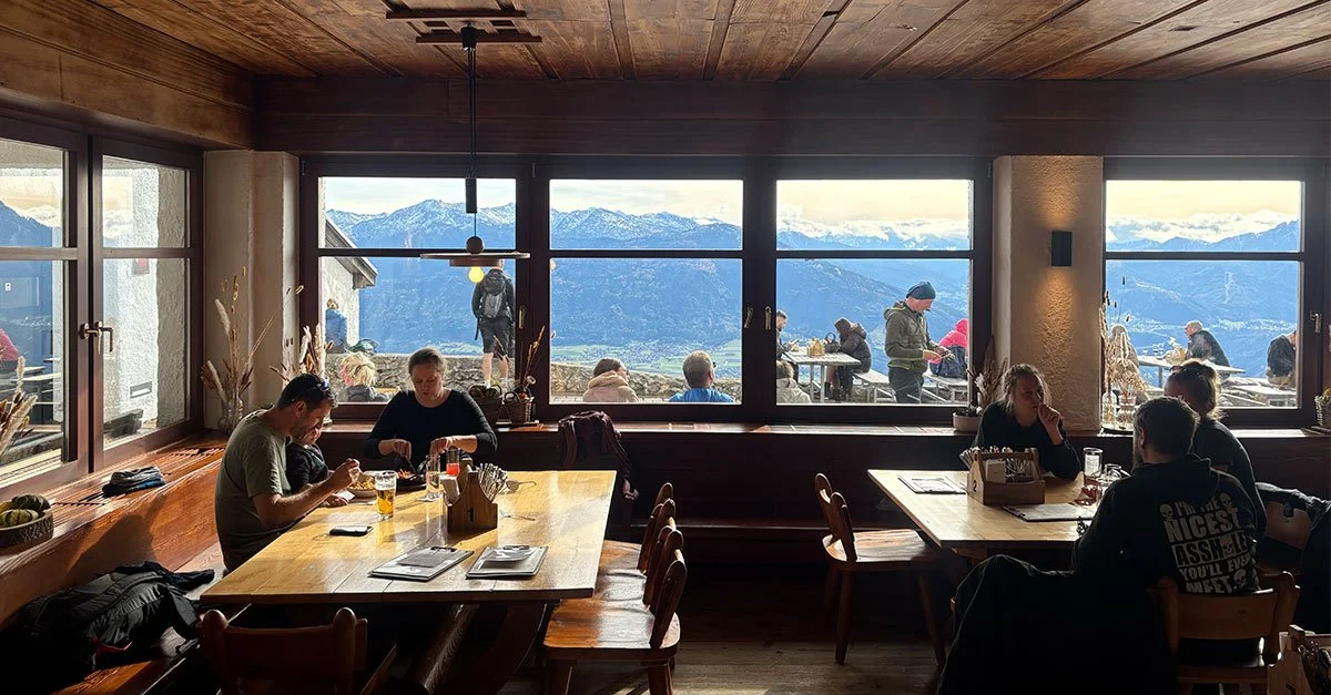
Rest and refuge in Nordkette near Innsbruck, Austria (photo by B Swayze).
Closing Thought
Designing for Humanity
Whether it’s an airport terminal, emergency room, school website, or shopping app, the most powerful UX principle remains the simplest: empathy.
The true test of good design isn’t how easily you can use it:
it’s how confidently someone else can,
even when the moment feels chaotic.
And this lesson isn’t just for UX designers. It’s for anyone who builds, teaches, leads, or connects with others. It’s for all professions.
It’s for all of us.
Because design, at its heart, is about being human and living with empathy for the people walking beside us, even when their journey looks different from our own.
Let’s Build What Matters
Every click, every conversation, every experience is a chance to meet people where they are.
At Swayze Design Studio, we design with empathy, creating systems, stories, and spaces that don’t just work, but connect.
Because when design speaks human, it builds trust, clarity, and meaning.
Let’s build what matters, something that helps people feel seen, understood, and at home.
Resources for You
For an explanation about how proximity shapes visual understanding, Aurora Harley’s Nielsen Norman Group article, “Proximity Principle in Visual Design”, offers a great overview of the Proximity Principle in design.
Megan Brown’s Nielsen Norman Group video, “Continuation: Gestalt Principle for User Interface Design”, explores how the Principle of Continuation helps users follow patterns and movement through interface layouts.
To better understand how expertise can create blind spots, Bryce Hoffman’s Forbes article, “The Curse of Knowledge: What It Is and How to Overcome It” (July 27, 2024), provides a practical exploration of how to recognize and overcome this common cognitive bias in leadership.
Susan M. Weinschenk’s book 100 Things Every Designer Needs to Know About People (2nd Edition, New Riders, June 25, 2020) offers evidence-based insights on human psychology that every designer should keep close at hand. The book itself is an example of great UX design with it’s clear, accessible presentation of information.